What's New for Blackbaud CRM SDK v3.0
This content represents improvements made to the SDK and overall developer experience for version 3.0.
- Unload Spec
- Design Mode in Web Shell
- Blackbaud Data Warehouse
- Batch
- List Builder
- Pages
- Wrapped SP SDK Templates Enhancements
- Data Lists: Improvements for Relational Data Lists with Large Data Sets
- Data Lists: Canceling long-running stored procedure-based data lists
- UI Widgets
- Tasks
- SDK Installation Defaults
- Default Values for Attributes in Catalog Item Specs
- SDK AppFx Solution Wizard
- Replacing FormUIComponent with WebUIComponent
- Persistent Fields for Search Lists
- Updated Behavior for Drop-down Fields
- RecordIDParameter Attribute for the Context Element
- Attribute Values for Fields That Contain Formatted HTML Text
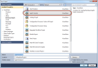
The Blackbaud CRM SDK now includes an option to unload most specs. The SDK installer and SetupBBDeveloper.exe inserts the new UnloadSpec external tool into Visual Studio, and you can access the option from the Tools menu to unload a spec.
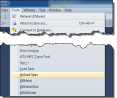
Figure: You access the Unload Spec option through the Tools menu in Visual Studio.
Implementation of this new tool is very similar to loading a spec. The tool runs the same LoadSpec.exe utility that adds catalog specs into a Blackbaud CRM installation, but it includes a "/U" command line switch to designate unloading. This command line switch calls a new method in SpecHelpers that invokes a new CLRstored procedure called USP_UNLOADSPEC that removes the spec. Unlike the LoadSpec operation, the USP_UNLOADSPECstored procedure does not require the entire XML for the spec; it only requires the spec type and catalog ID.
The new UnloadSpec external tool is only intended to help SDK developers work on features in a development environment. It is not intended as a mechanism to unload specs that were previously shipped or specs that were deployed to a production environment.
The UnloadSpec external tool works with most spec types, but the following spec typesdo not currently support the new functionality:
-
Batch types/Batch type extensions
-
Business processes
-
Query View spec extensions
-
Reports
For more information about UnloadSpec, see Unload Specs. For information about LoadSpec, see LoadSpec.
Users with administrative rights can now access Design Mode from the Web Shell user interface. Previously, Design Mode was only available through the ClickOnceSmart Client user interface. When an administrator opens Blackbaud CRM in a web browser, a new toggle button for Design Mode appears in the top right. To turn Design Mode on or off, simply click this button.
Figure: In the Web Shell user interface, administrators can use the new button in the top right to toggle Design Mode on and off.
In Design Mode, administrators can customize the program to better meet their organization's needs. For example, they can add pages, tabs, and sections to display data, and they can add actions such as buttons and links to define what users can do in different areas of the program. In addition, they can view the XML that makes up pages and the XML for items such as Data Forms and Data Lists.
In Design Mode, administrators can right-click the actions in functional areas to access a Design Mode menu with options such as assigning permissions for the actions and viewing the XML for actions or pages.
Figure: Right-click tasks in functional areas to view design options.
Design Mode also exposes design options at the top of editable areas such as pages, tabs, and sections. Administrators can use these options to edit properties, view XML, and perform other actions.
Figure: In Design Mode, you can access design options for pages, sections, and other editable areas.
The button to toggle Design Mode on and off appears by default for administrators, and it is not available to users in other roles. If necessary, you can hide the option from administrators as well. Just go to your installation directory's vroot folder to open the Web.config file, and in the <appSettings> section, add an entry with a value of False for the WebShellDesignModeEnabled key:
<add key="WebShellDesignModeEnabled" value="False" />
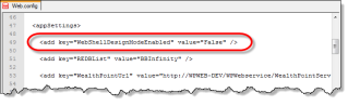
Figure: To hide the Design Mode button from administrators, set the WebShellDesignModeEnabled key to "False" in the Web.config file.
For more information about how to hide or display the Design Mode button in Web Shell, see Hide or Display Design Mode Button. For more information about how to use Design Mode, see the Blackbaud CRM Page Designer Guide.
Querying the Data Warehouse: MartKey Attribute
The MartKeyattribute was added to the Smart Query spec. This optional attribute in the SmartQuerySpec element can specify to create Transact-SQL functions in the Blackbaud Data Warehouse database instead of the transactional database. This enables Blackbaud CRM features to execute smart queries from the warehouse database.
For more information, see Ron Frum's blog post at Blackbaud Developer Network called BBDW 3.0 – Ad-Hoc Query.
The MartKeyattribute was also added to the specs for SQL Functions, SQL Stored Procedures, and SQL Views. Most database objects within the data warehouse live within the "BBDW" schema. For smart queries, you can add FunctionSchema="BBDW" to the TVFImplementationelement. For SQL Stored Function Specs, you can add DBFunctionSchema="BBDW" to the SQLFunctionSpecelement. For SQL Stored Procedure Specs, you can add SPSchema="BBDW" to the SQLStoredProcedureSpecelement. For SQL View Specs, you can add DBViewSchema="BBDW" to the SQLViewSpecelement.
For more information, see Ron Frum's blog post at Blackbaud Developer Network called BBDW 3.0 – SQL Objects.
 <SQLStoredProcedureSpec
	xmlns="bb_appfx_sqlstoredprocedure"
	xmlns:common="bb_appfx_commontypes"
	ID="b56ad5cb-a133-4f37-a466-224be2df74e9"
	Name="USR_USP_SQLSTOREDPROCEDURE1"
	Description="REPLACE_WITH_DESCRIPTION"
	Author="Technical Training"
	SPName="USR_USP_SQLSTOREDPROCEDURE1"
  	MartKey="BBDW"
  	SPSchema="BBDW"
	>
ETL Parallelism
As of version 3.0, you can select to process up to four lanes of packages which move data from the transactional database to the Blackbaud Data Warehouse database. You enter how many lanes (1-4) to use from the Edit Advanced Data Mart Settingsscreen for the deployment utility. The field is Max ETL Parallelism under Deployment Options.
The Master SSIS now contains four lanes which work off a queue. For more information about how the Master SSIS package works, see Master ETL Package (BBDW_ETL.dtsx) in the guides for Blackbaud Data Warehouse.
Schema Validation
As of version 3.0, from the data mart page for a Blackbaud Data Warehouse, you can run a validation process that checks dozens of qualities of the database schema. There is an option to include extensions as a part of the checks. For more information, see Ron Frum's blog post at Blackbaud Developer Network called BBDW 3.0 – Validation.
Figure: Validation options for the Blackbaud Data Warehouse
A freshly deployed warehouse database using only out-of-the-box specs should pass the validation. The following shows the results of a validation where schema issues were intentionally introduced.
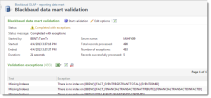
Figure: Validation results where issues exist with the schema
Schema Updates (Tables and Views)
A previous release of Blackbaud CRM (2.93) included updates to the schema for revenue and financial transactions in the transactional database. In order to provide fuller access to that data from Blackbaud Data Warehouse, financial transaction and revenue structures have been updated in the warehouse database and the OLAP cube. The FACT_REVENUE table has been replaced with the FACT_REVENUE view. Previously, the ETL process populated the FACT_REVENUE table. Now the FACT_REVENUE view maps to a set of new tables in the Blackbaud Data Warehouse database.
The FACT_REVENUE_STAGE table was removed because the FACT_REVENUE view is not populated by an ETL process. The procedures to create or drop indices during the ETL process were also removed.
For example, previously the REVENUELOOKUPID column on the FACT_REVENUE table was populated by the ETL process which queried the dbo.[FINANCIALTRANSACTION].[USERDEFINEDID] column in the transactional database. Now the view maps the column to BBDW.[FACT_FINANCIALTRANSACTIONLINEITEM].[FINANCIALTRANSACTIONLOOKUPID], a column in the Blackbaud Data Warehouse database. The new table, BBDW.[FACT_FINANCIALTRANSACTIONLINEITEM] is populated by the ETL process which queries various tables in the transactional database. For a list of new, modified, and removed tables and views, see the What's New reference.
The FACT_MEMBERSHIPSTATUS table was deprecated. The procedure to create or drop indices during an ETL process was also removed. There were no dependencies on the FACT_MEMBERSHIPSTATUS table in the shipped OLAP cube and the table was not populated by the ETL process. Membership status information is available through DIM_MEMBERSHIPSTATUS and v_DIM_MEMBERSHIPSTATUS.
Revenue Post Status codes changed. Prior to the Blackbaud CRM 3.0 release, the codes were: 0-Do Not Post; 1-Posted; 2-Not Posted. Revenue Post Status codes are now as follows: 1-Not Posted; 2-Posted; 3-Do Not Post. This change was made to ensure the information is synched between the data warehouse and the transactional database.
Many changes listed as modifications were changes to the MS_Description extended property on database entities such as tables and columns. This metadata was updated throughout the database schema in conjunction with the new validation feature. Other schema updates include adding procedures to support the new validation feature, columnstore indexes, and the new ETL parallelism feature.
For more information, see the technical reference here.
New Batch Type Add-In Spec
A Batch Type Add-in allows a software developer to register a Webshell Event Handler (behavior) for an out-of-the-box batch type via a new type of spec: BatchTypeAddInSpec. The 3.0 version of the SDK ships with a new item template and schema (BatchTypeAddInSpec.xsd) that you can use from within your UIModel project. To create a Batch Type Add-In, you add a new item to your UI Model project and select a new item template named BatchTypeAddIn Spec. More...
A Batch Type Add-In code sample can be found within the UIModel project's Blackbaud.CustomFx.FoodBank\Blackbaud.CustomFx.FoodBank.UIModel\AddIns\ConstituentBatch.AddIn.xml spec file and corresponding visual basic class file ConstituentBatch.AddIn.vb. Be sure to download and review the sample within the 3.0 Food Bank Source Code .
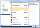
Figure: Adding a new Batch Type Add-in is a simple matter of selecting the appropriate catalog item (spec) template.
Extensions such as a data form extension and batch extension allow the developer to add fields AND behavior to an out-of-the-box feature. Add-Ins, such as a batch type add-In or data form add-in are used to add only behavior. This is great news as the batch type add-in allows developers to only inject behavior into an out-of-the-box batch type WITHOUT having to use a batch extension.
BatchTypeSpec Element's New WebSummaryPanelHandler Element
The BatchTypeSpecelement has a new optional child element named WebSummaryPanelHandler. This new element allows a custom handler to be specified, which allows the rendering of a summary panel for a given batch within the Web Shell batch user interface.
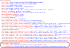
Figure: The Enhanced Revenue Batch utilizes a WebSummaryPanelHandler element.
BatchTypeSpec Element's New AllowExport Attribute
The BatchTypeSpecelement has a new optional attribute named AllowExport that indicates whether the data from the batch type can be exported. The default value is true. Setting the value to false will remove the Export action button from the Web Shell batch user interface grid.
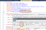
Figure: An SDK developer can use the AllowExport attribute to hide the Export action button.
RowContextWindow Element's PageContextFieldID Attribute
The RowContextWindow element's PageContextFieldID attribute is used to provide the context ID for the "Go to" page functionality. If not specified, the RowContextWindowelement's ContextFieldID is used.
New RaiseExceptionForAutoMatchesFieldID Attribute for the AutoMatch Element
The AutoMatchelement's RaiseExceptionForAutoMatchesFieldIDattribute is optional. The attribute accepts a Boolean field in the load procedure of SaveAutoMatchDataFormID that will be evaluated if an exception is raised when an auto-match occurs.
RaiseExceptions Element
The RaiseExceptionselement is part of duplicate record checking within AutoMatch. Within the BatchTypeSpecelement's DuplicateRecordCheckelement, the AutoMatchelement allows the configuration of auto match rules for the batch type. The RaiseExceptionselement supports duplicate-record checking by providing the ability to call a Data List that evaluates whether to raise an exception when an auto-match occurs.
List Builder and Data List Export and Paging Usability Enhancements
Enhancements were made to both Data List and List Builder to improve performance and usability. No SDK-level action or configuration is required to achieve this functionality.
Several secondary actions for both Data List and List Builder now appear in a More dropdown menu. Actions such as Add and Refresh still appear in the action bar, but users now access secondary actions such as RSS feed, Download to CSV, and Reset grid defaults through the More dropdown.
Data Lists and List Buildersalso both now feature enhanced paging options. When the number of rows in a Data List or List Builder requires multiple pages, the paging options now include a field where users can enter a page number. For example, if a Data List or List Builder includes 32 pages of entries and users want to go directly to the middle of the list, they can enter "16" in the field and press Enter on the keyboard.
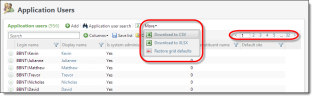
Figure: Data Lists and List Builders now display secondary options under More and provide improved paging options.
General Usability improvements
Enhancements were made to List Builder to improve usability. No SDK level action or configuration is required to achieve this functionality.
When users open a saved list in the program, the list name now appears at the top of the grid. When they modify a saved list, an asterisk appears beside the list name to indicate the change. And if users save changes to an existing list, they can now select whether to update the existing list or save their changes as a new list.
Also, search behavior was also improved for List Builder. After users enter search criteria in the search field, it now displays a clear button that allows them to quickly clear the criteria, and after search results are displayed, the text from the search field is highlighted within the grid.
Finally, when users use column filters to limit the number of entries in the grid, a new Clear all filters button allows them to quickly clear all column filters and restore the grid.
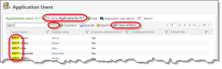
Figure: ListBuilder now includes enhancements to saved lists, search behavior, and filtering.
A food bank ListBuilder code sample can be found within the catalog project's Blackbaud.CustomFx.FoodBank.Catalog\ListBuilder\Final\FoodBankListBuilder.Query.xml spec file. Be sure to download and review the sample within the latest Food Bank Source Code.
See List Builder Videos for more information on building a List Builder.
New CompositeColumn and ColumnTemplates Elements
Query Views help define and provide data to List Builders. The ListBuilder element describes information used to render the query output in a List Builder page section. The ListBuilder element's Column element provides the ID of a Query View's OutputField element. This marks the column to be included in the default set of columns that are displayed when the List Builder is created. on the page. The CompositeColumnelement is used within the Columnelement to display multiple output fields in one column. Within the CompositeColumnelement, the OutputFieldselement may contain multiple OutputFieldelements. Each OutputFieldelement denotes a field in the Query View's output that will be used to build the composite field's value.
For more details see Composite Columns, Displaying an Image within a Column, and Building Column Templates
Figure: ListBuilders can now display composite columns within a column. The layout of the columns is determined by the HTML defined in the ColumnTemplates element.
The QueryViewSpec contains a new optional ColumnTemplateselement that allows the use of an HTML template to control the column layout. The ColumnTemplateselement contains a required URL attribute that provides a reference to the HTML file that contains the template markup. If not specified, the default column layout is applied.
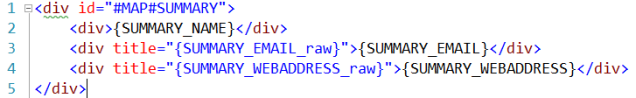
Figure: A sample HTML template for composite column layout
New PagingStyle Attribute Helps Paging and Search Performance
The QueryViewSpec's ListBuilderelement now contains an optional PagingStyleattribute that determines how paging and searching is performed. more...
QueryViewSpec OutputField's IsImageKey
The IsImageKeyattribute is an optional attribute for a QueryViewSpec's OutputFieldelement. The default value is false. The IsImageKeyattribute indicates that the value returned points to a resource file or form image.
Within a Data List or a Query View, a developer can display an image from a static resource. To display a static resource image, an image key prefixed with RES: (for images embedded in the Blackbaud.AppFx.Browser.exe assembly) or CATALOG: (for images embedded in catalog assemblies) is returned from the Query View or Data List as the value for a special output field which has its IsImageKey value set to True.
For more informationm see Displaying an Image within a Column.
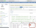
Figure: The confidence composite column displays an image.
Display of DetailViewForm and Legend for List Builder within a Page
The PageDefinitionSpec contains a new RenderStyleelement that describes the render style used for a List Builder. The RenderStyleelement contains a single StandardViewelement that allows for a DetailViewFormelement. This allows for a ListBuilder page section to display a detail view form for each row within the List Builder. See Adding a Detail View Form to List Builder Page Section for details.
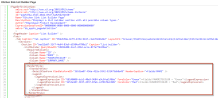
Figure: Specifying a detail view form and legend within a List Builder page section
The StandardView element also allows for a Legend element. Within the Legend element, the LegendExpressionList element is used to provide a series of LegendExpressionelements. See the figure above. In this way, you can add multiple expressions that evaluate to either true of false. ForeColor, Bold, Italics, and DisplayStyle attribute values are applied to the rows that meet the expression criteria. In the example below, each row where the LINEAMOUNT (Tx Detail Line Amt) column is greater than $10.00 causes the relevant text within the row to be displayed in bold font with green letters. See Adding a Legend to List Builder Page Section for details on how to create a legend within a page section.
For an example, see the updated KitchenSinkListBuilder.Query.xml within the Kitchen Sink code samples that ship with the 3.0 SDK. The code sample can be found within the catalog project in the \SDK\Samples\WebShellKitchenSink.Catalog\ListBuilder folder.
For more information on setting up the kitchen sink, be sure to check out our Kitchen Sink Videos
New AllowSearch Attribute for the ListBuilder Element
A new ListBuilder element within a PageDefinitionSpec describes a section that displays a list builder. The ListBuilder element includes a AllowSearch attribute. With a default value of true, the new AllowSearchattribute determines whether the list supports a 'Search' filter. Setting the attribute value to false causes the Search box to disappear.
<ListBuilder QueryViewID="AE91E1A7-2130-409C-8D06-198030EB0AA7" AllowSearch="false">
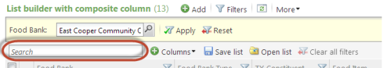
Figure: If you set the AllowSearch attribute to false, the search box is hidden.
New AllowSave Attribute for the ListBuilder Element
A new ListBuilder element within a PageDefinitionSpec describes a section that displays a list builder. The ListBuilder element includes a AllowSave attribute. With a default value of true, the new AllowSaveattribute determines whether the list saves its list state such as parameter form field values, column filter values, sort settings, column order, and column widths. The settings are "sticky," which means they are saved each time the list is altered and are applied when the user returns. The Save list and Open list buttons only appear when the setting is true. When you load a saved list, any rows added since the last run will show up if they meet the criteria of the saved list.
<ListBuilder QueryViewID="AE91E1A7-2130-409C-8D06-198030EB0AA7" AllowSave="true" >
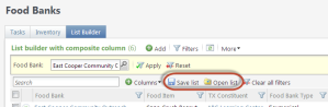
Figure: The AllowSave attribute determines whether list state such as form field values, column filter values, sort settings, column order, and column widths are saved.
New AllowColumnFiltering Attribute for the ListBuilder Element
A new ListBuilder element within a PageDefinitionSpec describes a section that displays a list builder. The ListBuilder element includes a AllowColumnFiltering attribute. With a default value of true, the new AllowColumnFilteringattribute determines whether the list supports filtering rows based on column values. Setting the value to false removes the filter icon from each column within the list.
<ListBuilder QueryViewID="AE91E1A7-2130-409C-8D06-198030EB0AA7" AllowColumnFiltering="true">
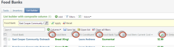
Figure: Column search filters in a List Builder
New AllowColumnConfiguration Attribute for the ListBuilder Element
A new ListBuilder element within a PageDefinitionSpec describes a section that displays a list builder. The ListBuilder element includes a AlllowColumnConfiguration attribute. With a default value of true, the new AlllowColumnConfigurationattribute determines whether the list supports adding, removing, and reordering of columns. Setting the value to false hides the Columns picker that allows users to add and remove columns from an available column list and prohibits them from dragging and reordering columns.
<ListBuilder QueryViewID="AE91E1A7-2130-409C-8D06-198030EB0AA7" AllowColumnConfiguration="true">
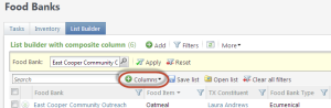
Figure: Setting AlllowColumnConfiguration to false removes the ability to choose the columns that appear. It also prevents column reordering.
New ItemsPerPage Attribute for the ListBuilder Element
A new ListBuilder element within a PageDefinitionSpec describes a section that displays a list builder. The ListBuilder element includes a ItemsPerPage attribute. With a default value of 30, the new optional ItemsPerPageattribute determines the number of rows to display per page.
<ListBuilder QueryViewID="AE91E1A7-2130-409C-8D06-198030EB0AA7" ItemsPerPage="5">
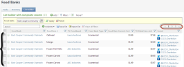
Figure: The ItemsPerPage attribute determines the number of rows per page.
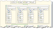
Double Tabs (Two-tier Tabs)
As of version 3.0, you can add a second set or tier of tabs to a top-level tab on a page. The Kitchen Sink samples that come with the SDK include a Page Definition Spec which demonstrates a tab with one tier and a tab with a second tier of tabs.
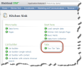
Figure: The Kitchen Sink samples include an example of two-tier tabs.
To add a second tier of tabs, you can use the Tabselement within the Tab element which declares a top-level tab. As with top-tier tabs, second-tier tabs are uniquely identified and can contain sections. Here is a "Hello World" example that shows a second tier of tabs. Notice the Tabs element in the first Tab. This example displays a web page on each tab.
<PageDefinitionSpec
    xmlns="bb_appfx_pagedefinition"
    xmlns:common="bb_appfx_commontypes"
    ID="96a2bb06-e909-4f4a-8f35-db160ae04311"
    Name="Double Tabs Hello World Page"
    Description="A page for displaying a double tabs hello world"
    Author="Technical Training"
    >
  <PageHeader Caption="Double Tabs Hello World" />
  <Tabs>
    <Tab ID="9c109995-2838-4173-b0ba-0b324c42fe3d" Caption="Blackbaud Developer Network" Visible="True">
      <Tabs>
        <Tab Caption="Home" ID="152AA6C0-6C63-46EB-9C08-99FDDFCE2EB4">
          <Sections>
            <Section ID="30655356-F37B-4B55-96EF-29558F12CB4A">
              <WebPage Url="http://www.bbdevnetwork.com/"></WebPage>
              <HelpKey>http://www.bbdevnetwork.com/</HelpKey>
            </Section>
          </Sections>
        </Tab>
        <Tab Caption="Q and A" ID="1C85E823-07B3-4FA0-B096-5A2FAE2C7DDA">
          <Sections>
            <Section ID="54C3EFC1-4F32-4AB4-A7D3-F4E8B3A597C2">
              <WebPage Url="http://www.bbdevnetwork.com/qa/"></WebPage>
              <HelpKey>http://www.bbdevnetwork.com/qa/</HelpKey>
            </Section>
          </Sections>
        </Tab>
      </Tabs>
    </Tab>
    <Tab ID="1298D15C-55A6-4A5D-83E1-C25AC5C1808A" Caption="Online Guides" Visible="True">
      <Sections>
        <Section ID="BB7FF46F-276E-49CA-930E-5AAD6815F5D3">
          <WebPage Url="https://www.blackbaud.com/files/support/guides/infinitydevguide/infsdk-developer-help.htm"></WebPage>
          <HelpKey>https://www.blackbaud.com/files/support/guides/infinitydevguide/infsdk-developer-help.htm</HelpKey>
        </Section>
      </Sections>
    </Tab>
  </Tabs>
</PageDefinitionSpec>
When you add a help key to a section, it appears as a link when you click the help button or press F1. But when you add a help key to a tab, no link is rendered. In the following image, the links are to help keys defined on sections and not tabs.
Figure: Help links do not appear when you add help keys to tabs.
Dependent Sections
As of version 3.0, you can add a list of dependent sections to a section in a page. Sections in this list are refreshed when InvalidateDependentSections is called from a UIModel in the section which contains the list. The Kitchen Sink samples which come with the SDK include a Page Definition Spec and a View Data Form with a UI Model which demonstrates dependent sections.
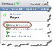
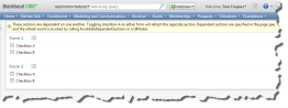
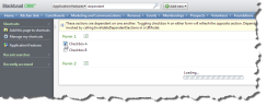
Figure: The Kitchen Sink samples include an example of dependent sections.
Here is a "Hello World" example that shows a dependent section. It works in the same way as the Kitchen Sink example. One of the sections in the Page Definition Spec contains a DataForm and DependentSections. The DataForm is a View Data Form with a UI Model which calls InvalidateCurrentData when the checkbox on the form is clicked. InvalidateCurrentData is part of the Blackbaud.AppFx.UIModeling.Core library. The DependentSection indicated is the other section on the page that contains a DataList. When the checkbox is clicked, the DataList is refreshed.
Page Definition Spec
<PageDefinitionSpec
    xmlns="bb_appfx_pagedefinition"
    xmlns:common="bb_appfx_commontypes"
    ID="4974357b-22d0-4427-8cf1-e41917aad808"
    Name="Dependent Sections Hello World Page"
    Description="A page for displaying a dependent sections hello world example"
    Author="Technical Training"
    >
  <PageHeader Caption="Dependent Sections Hello World Page"/>
  <Tabs>
    <Tab ID="4e6de00e-33c6-49e7-b632-b50cd7b17596" Caption="Tab">
      <Sections>
        <Section ID="6df0b079-ac13-454d-90fb-f75ca75cc61b" Caption="Section 1">
          <DataForm ID="f5090b3b-e24f-41dc-bfb2-593c9db1d1b7"/>
          <DependentSections>
            <DependentSection ID="4714E6A9-AC58-4945-BA4E-803C869F6AFB"/>
          </DependentSections>
        </Section>
        <Section ID="4714E6A9-AC58-4945-BA4E-803C869F6AFB" Caption="Section 2">
          <DataList ID="c10c62f7-55a5-437b-b42a-9b8fea3030b8">
            <RenderStyle>
              <StandardView />
            </RenderStyle>
          </DataList>
        </Section>
      </Sections>
    </Tab>
  </Tabs>
</PageDefinitionSpec>
View Data Form Spec (XML)
<ViewDataFormTemplateSpec
    xmlns="bb_appfx_viewdataformtemplate"
    xmlns:common="bb_appfx_commontypes"
    ID="061349e5-bb0a-46c7-a0e2-de251be73965"
    Name="Dependent Sections Hello World View Data Form"
    Description="A data form for a dependent sections hello world example"
    Author="Technical Training"
    DataFormInstanceID="f5090b3b-e24f-41dc-bfb2-593c9db1d1b7"
    RecordType="Dependent Sections Hello World"
    common:SecurityUIFolder="Dependent Sections Hello World"
    >
  <CLRDataForm AssemblyName="Custom.AppFx.DoubleTabs.Catalog" ClassName="Custom.AppFx.DoubleTabs.Catalog.DependentSectionsHelloWorldViewDataForm" />
  <common:FormMetaData>
    <common:FormFields>
      <common:FormField FieldID="FIELD1" Caption="Refresh when clicked" DataType="Boolean" />
    </common:FormFields>

    <common:WebUIComponent>
      <common:UIModel AssemblyName="Custom.AppFx.DoubleTabs.UIModel.dll" ClassName="Custom.AppFx.DoubleTabs.UIModel.DependentSectionsHelloWorldViewDataFormUIModel" />
      <common:WebUI>
        <common:ExternalResource Url="browser/htmlforms/DependentSectionsHelloWorldViewDataForm.html" />
      </common:WebUI>
    </common:WebUIComponent>
  </common:FormMetaData>
</ViewDataFormTemplateSpec>
View Data Form (VB)
Imports Blackbaud.AppFx.Server

Public NotInheritable Class DependentSectionsHelloWorldViewDataForm
    Inherits AppCatalog.AppViewDataForm

    Public Overrides Function Load() As Blackbaud.AppFx.Server.AppCatalog.AppViewDataFormLoadResult
        Return New AppCatalog.AppViewDataFormLoadResult(True)
    End Function

End Class
View Data Form (UI Model HTML)
<div id="#MAP#DependentSectionsHelloWorldViewDataForm">
  <table>
    <tr id="#MAP#FIELD1_container">
      <td>
        <span id="#MAP#FIELD1_caption" class="bbui-forms-captionlight"></span>
      </td>
      <td>
        <input id="#MAP#FIELD1_value" type="checkbox" />
      </td>
    </tr>
  </table>
</div>
View Data Form (UI Model VB)
Public Class DependentSectionsHelloWorldViewDataFormUIModel
    Private Sub DependentSectionsHelloWorldViewDataFormUIModel_Loaded(ByVal sender As Object, ByVal e As Blackbaud.AppFx.UIModeling.Core.LoadedEventArgs) Handles Me.Loaded

    End Sub

    Private Sub _field1_ValueChanged(sender As Object, e As ValueChangedEventArgs) Handles _field1.ValueChanged
        Me.InvalidateCurrentData()
    End Sub
End Class
Wrapped SP SDK Templates Enhancements
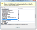
Minor enhancements were made to the Wrapped SP catalog item (spec) templates for Add Data Forms, Edit Data Forms, View Data Forms, and Record Operations. These Wrapped SP templates provide the ability to create a custom feature where the stored procedure logic was delegated through the out of the box spec. For example, prior to SDK version 3.0, if you selected the Record Operation Spec (Wrapped SP) template, you’d see the following dialog and be expected to select one of the out-of-the-box record operation specs on your disk:
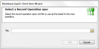
Figure: An example of a pre-3.0 Wrapped SP wizard screen
Prior to 3.0, the dialog would prompt you for the XML file on disk to use as the basis for the new spec. Unfortunately, not many 3rd party developer outside of Blackbaud had the XML file for the spec to be wrapped and obtaining the XML for the spec can be a cumbersome experience. Fortunately, we have done away with the file prompt above in favor of searching for the feature itself. This makes it a whole lot easier and intuitive to select the spec you wish to wrap.
Now with version 3.0, when you add a new catalog item and select a wrapped SP catalog item such as Record Operation Spec (Wrapped SP):
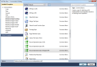
Figure: Selecting a Wrapped SP catalog item in SDK version 3.0
… the Record Operation Search screen appears instead of a prompt asking for the spec file:
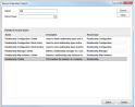
Figure: New feature search screens for Wrapped SP specs for SDK version 3.0
… and after you select a record operation, the template generates a wrapped version of that feature (which you can then tweak as needed).
For a complete code sample of implementing a wrapped SP record operation, click here.
Data Lists: Improvements for Relational Data Lists with Large Data Sets
Improvements were made to relational Data Lists that manage large data sets. Within a PageDefinitionSpec (Page), it has always been possible for the developer to display a Data List in a relational (tree) view by placing a RenderStyle parent element that contains a RelationalView child element.
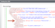
Figure: Example of a PageDefinitionSpec displaying a tab with a DataList displayed in RelationalView
Paging for Relational Data Lists
In an effort to improve performance, all relational Data Lists within the Web Shell user interface now automatically page when more than 25 top-level records are present. No SDK-level action or configuration is required to achieve this functionality. In the screen shots below, the Data List is displayed relationally within the page. The Data List contains 26 top-level price lists. Notice the 26th item is pushed to a second page.
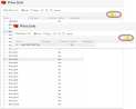
Figure: Automatic paging with more then 25 top-level records
RelationalView Element's LimitRowsDisplayed Attribute
Setting the LimitRowsDisplayedattribute determines whether the number of rows rendered in the list will be limited based on the performance capabilities of the web browser. The default value is false. This setting is good for trees that have very deep hierarchies with lots of items, where one page may still contain a many rows of data. When the setting is true and the maximum number of items have been loaded, the user will see a message stating that additional rows are available but are not displayed. The maximum number of rows is automatically selected based on the user’s browser:
- Internet Explorer – 500 items
- Chrome—1,000 items
- All other browsers—800 items
For trees that are very deep — e.g. trees that have many items per page — we recommend using the following combination of settings that causes the tree to load collapsed, and the user can dive into the nodes that are important to them. As users navigate the tree and open too many items, they will be alerted that the tree can no longer render more items and they will be unable to expand other areas of the tree. However, if they want to expand different segments of the tree, they can refresh the tree (it will collapse again) and then dig further into different portions of the tree.
- LimitRowsDisplayed = true
- ExpandFirstLevelNodes = false
- ExpandAllOnLoad = false
RelationalView Element's HideExpandAll and HideCollapseAll Attributes
Enabling the HideExpandAllattribute option hides the Expand all button at the top of the tree. You should consider enabling this option when LimitRowsDisplayed=true and when expanding all items is likely to immediately place the user in a situation where the maximum item count is reached. Setting the HideCollapseAllattribute equal to true hides the Collapse all button at the top of the tree.
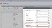
Figure: The HideCollapseAll and HideExpandAll attributes in Design Mode
Data Lists: Canceling long-running stored procedure-based data lists
Web API
When using the AppFx Web API, calls to stored procedure-based Data Lists (non-CLR-based Data Lists) can now be canceled. The AppFx web service DataListLoad method/operation now honors the .CancelID property for the DataListLoadRequest. After the DataListLoad method is canceled, it will return to the calling application as if it had completed normally. However, the API developer can inspect the DataListLoadCompletedEventArgs within the DataListLoadReply to verify the cancellation via the .DataListLoadWasCancelled property.
Here is a code sample of a console application demonstrating how to cancel a long-running stored procedure-based Data List using the AppFxWebService.
If a Data List takes a long time to load, the SQL may be inefficient or your overall feature may require a design change. Use SQL Server's Management Studio to analyze the query's execution plan. You may find a better way to write the query. If the Data List is returning a large list of rows, you may want to consider a change in your overall feature's design. If your goal is to use the Data List to process a bunch of data and return a result, you may want to consider using a business process to perform the processing.
New IsCancelable Attribute for Generic UI Actions
Within a Data Form's FormMetaData section, a new IsCancelable attribute is now available within the UIAction element. The term "Data Form" applies to a traditional Data Form such as a an Add Data Form, View Data Form, Edit Data Form or a Custom UI Model. Use of the attribute only applies to a UIActionelement that is generic, meaning the UIAction does not contain child elements such as ShowAddForm or ShowDataForm. When UI Model code is generated from the Data Form, the generic UIAction allows the developer to code an event handler for the UIAction. The UIAction can render as a button or link on the Data Form. This provides a mechanism to run code on the server side, such as making a call to a Data List to retrieve some rows of data.
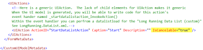
Figure: The IsCancelable attribute is only applicable to generic UIAction elements.
Setting the IsCancelable=trueattribute to your generic UIAction and generating your UI Model for the Data Form (or Custom UI Model) makes it possible to access the .CancelID property on the UIModeling.Core.InvokeActionEventArgs that gets passed into the InvokeAction event handler for that UIAction. If the work you perform within your UI model's action event handler involves utilizing the AppFx service method that implements ICancelAsync, you will be able to pass the .CancelID property to the web service request that knows how to be canceled.
Because IsCancelable is true, a Cancel button appears on the Loading dialog screen after the action is invoked. more...
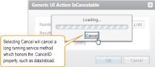
Figure: The user selects cancel
A code sample demonstrating a generic UIAction with an IsCancelableattribute can be found within the GenericUIActionIsCancellable.Custom.xmlCustom UI Model spec in the SPDataList.Catalog visual basic project. A code sample demonstrating a call to a long-running stored procedure-based Data List from a generic UIAction event handler can be found within the GenericUIActionIsCancelableUIModel.vb UI model class within the visual basic project named IsCancelable.UIModel. The code sample can be found here.
Display a DetailViewForm for a Selected Row in a List Widget
You can retrieve the data for a UI Widget with either a Data List, Data Form, or Custom UI Model. When you use a Data List to provide data to the widget, you can render the data as either a List or a Chart. For SDK version 3.0, when rendering the data from a Data List as a list, the developer can elect to display a View Data Form to show detail for each row in the list. Within the RenderStyle element's List element is a new element named DetailViewForm and its corresponding ViewDataFormID and RecordIDFieldattributes. The ViewDataFormIDattribute indicates the Data Form instance ID of a View Data Form to use to display the detail for each row. The RecordIDField attribute indicates the name of the column to use as the source for the record ID for the View Data Form. Use this new element and attributes in conjunction with the Listelement's EnableSelection attribute, which should be set to True. In this way, the user can select a row in the list that causes the detail to be displayed for the selected row.
Figure: Displaying details for each row of a List UI Widget
A code sample can be found within the catalog project's Blackbaud.CustomFx.FoodBank.Catalog\UI Widgets\Low Inv BP Run\List Widget\FoodBankTopShortages.UIWidget.xml spec file. Be sure to download and review the sample within the 3.0 Food Bank Source Code
New AlwaysVisible Attribute for the MoreLink Element
The UIWidgetSpec's MoreLinkelement contains a new attribute named AlwaysVisible that indicates whether the more link should always be visible. When AlwaysVisible is set to false, the more link will only appear if the UI Widget has data.
PervasiveSearchOptions Contains New PlaceholderText and PlaceholderTextResourceKey Attributes
A TaskSpec may contain an optional PervasiveSearchOptionselement that describes the options for including the task in the list of available pervasive search lists. Two new attributes named PlaceholderText and PlaceholderTextResourceKey were added to the PervasiveSearchOptionselement. PlaceholderText provides a way to display text within the search box when the user has not entered a value, while PlaceholderTextResourceKey indicates the resource key to use for the localized placeholder text.
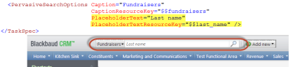
Figure: New placeholder text for pervasive search
PostActionEvent Toast
A TaskSpec now has the ability to display a "toast" notification after a task successfully completes. Within the TaskSpec, a developer can provide a Toast element within the PostActionEventelement. The Toast element's Importance attribute provides emphasis for the message while the Message attribute provides the message within the toast notification. The Importance attribute can be set to either Normal or High. Within the Toast element, a ConfirmEvent element provides a way to respond to the user when the toast notification message is clicked by specifying the event that occurs such as navigating to a page, refreshing a page, refreshing a section, etc. More...
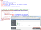
Figure: The Toast element within the PostActionEvent element enables cool and click-able toast notifications
When you install the Blackbaud Enterprise SDK, you can now designate default folders for creating projects and for building projects. You also can now specify a default value for the Author attribute in your catalog item specs and a default prefix for the names of database artifacts such as custom tables and stored procedures. The set these default settings, the SDK installation wizard features two new screens. On the first, you can designate your deploy folders.
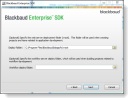
Figure: You can select deploy folders when you install the Blackbaud Enterprise SDK.
In the Deploy folder field, you can specify a default folder to use when you create projects. When you use a Blackbaud AppFx template to create a project in Visual Studio, this deploy folder defaults into the Folder field of the Select a deploy folder screen .
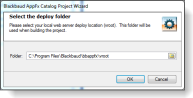
Figure: The deploy folder appears by default on the Select a deploy folder screen when you create a project.
And in the Workflow deploy folder field, you can specify a deploy folder to use when you build your projects.
On the second new screen, you can enter an author for catalog item specs and a prefix for database artifacts.
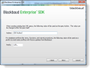
Figure: Enter an author for specs and a prefix for database artifacts when you install the Blackbaud Enterprise SDK.
In the Author field, you can enter a value for the Author attribute in your catalog item specs. This value appears by default in all the specs you create, but you can edit it as necessary.
And in the Prefix field, you can enter a prefix for the database artifacts that you create. The prefix is automatically added to the names of artifacts such as custom tables and stored procedures to indicate that you created them and to prevent conflicts with the names of Blackbaud artifacts.
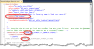
Figure: The author and prefix appear by default when you create a spec.
For recommendations about the prefix for database objects, see Commandment 5: Prefix Custom SQL Objects.
The SDK installer stores the values from these new screens in the Microsoft Windows registry. To edit the folders, author, or prefix after you install the SDK, open the registry and go to HKEY_CURRENT_USER\Software\Blackbaud\AppFx\SDK\Installer.
Figure: You can edit the default deploy folders, author, and prefix in the Microsoft Registry.
To access the SDK installation wizard and installation instructions, go to www.blackbaud.com and log in. In the Support menu, click Downloads, and then on the Downloads page, click Blackbaud Infinity SDK.
Default Values for Attributes in Catalog Item Specs
When you create a catalog item in Visual Studio, the name that you enter on the Add New Item screen is now used to create default values for many of the attributes in catalog item specs. For example, to create a new form to enter food types for your food bank, you can select Add Data Form Template Spec (CLR) and enter "FoodType" in the Name field.
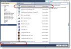
Figure: The entry in the Name field of the Add New Item screen is used to create default values for many attributes in catalog item specs.
In the resulting catalog item spec, the template splits "FoodType" into two words and uses it to create default values for spec attributes such as Name, Description, and RecordType. For example, the default value for the Name attribute is "Food Type Add Data Form" and the default value for the RecordTypeattribute is "Food Type."
When you enter the item name on the Add New Item screen, make sure to use Pascal-case to indicate where the template should use multiple words in the default attributes. The template separates the default values for attributes into separate words based on the capital letters in the item name.
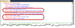
Figure: The "FoodType" example from the Name field is used to create default values for attributes.
With this new default behavior, catalog item specs will generally include fewer "REPLACE _WITH_xxx" tokens because more useful default values will already be in place.
The SDK now ships with a Blackbaud AppFx Solution Wizard template that creates a Visual Basic solution for creating Blackbaud AppFx-based components. This template enables the developer to quickly start building new features using the SDK.
The wizard's dialog screen prompts for the project types you wish to include in the solution including Catalog, UI Model, and Workflow projects. The template also prompts the user for the location of your local web application virtual directory folder in order to pre-configure the output path for the DLLs. This way, when you build the solution in Visual Studio, the DLLs will automatically be placed in the appropriate application virtual directory path.
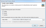
After completing the wizard, a new solution and projects will be created according to the project types selected on the wizard.
3rd party developers and customers will need to adjust the Build output path to include the custom folder as highlighted in yellow below.
Replacing FormUIComponent with WebUIComponent
The catalog spec templates for Add Data Forms, Edit Data Forms, and View Data Forms no longer include the FormUIComponent element by default. The FormUIComponent remains available in the CommonTypes schema for backward compatibility, but it is no longer included in the template because forms with the FormUIComponent element only work with the ClickOnceSmart Client interface and cannot be viewed in the Web Shell interface.
In addition, if you use FormUIComponent, the FixedDialog attribute is no longer available for the element. This attribute was removed because it only applies to ClickOnce and does not work with Web Shell.
For information about how to replace the FormUIComponent element with the WebUIComponent element, see Features that Require a Conversion to Web Shell. And for examples of creating a UI Model assembly project in Visual Studio and creating a UI Model, see Creating a UI Model Project.
Persistent Fields for Search Lists
The SearchListSpec elementnow includes a new PersistentFields element and its child PersistentFieldIDelement that allow you to designate persistent search fields that retain search criteria from previous searches. This allow users to exit search screens and still have their search criteria in place when they return for subsequent searches.
Figure: PersistentFields and PersistentFieldID elements in a Search List Spec
To designate persistent fields, insert the PersistentFields element after OutputFields and then specify persistent fields within the PersistentFieldIDelement. For example, if a search screen includes an Include Inactive checkbox, you can designate it as persistent so that after users select the checkbox, it remains selected until they clear it or click Clear to reset all search parameters.
Search screens throughout the program were also updated to make user preferences on column widths and sort order persistent, and background colors and inline messages were adjusted to improve usability. For information about these changes, see the New Features Guide.
For more information about how to make search criteria persistent, see Make Search Criteria Persistent for a Search List.
Updated Behavior for Drop-down Fields
Throughout the program, drop-down fields now support type-ahead functionality. This means that users can now consistently enter multiple characters in fields with drop-down lists. Previously, some drop-down fields only allowed users to enter a single character.
The new type-ahead behavior also allows users to view filtered versions of drop-down lists. The filtered lists only display entries from the drop-down lists if they match the characters that users enter in the fields.
To enable type-ahead functionality, default values were updated for two attributes.
-
First, the default value of the EnableTypeAhead attribute was changed to true. This attribute allows users to enter multiple characters in drop-down fields.
-
Next, the default value of the EnableTypeAheadFilter attribute was changed to true. This attribute allows users to view filtered versions of drop-down lists after they enter text in the fields.
Type-ahead functionality applies to all drop-down fields, regardless of whether drop-down lists are populated by simple Data Lists, simple value lists, or code tables.
This type-ahead functionality means that you can enter multiple characters in a drop-down field to go directly to an entry in the list. For example, when you add an address to a constituent record, you can enter "CO" in the State field to go directly to the "CO" entry from the state code table.
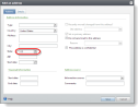
Figure: You can now enter multiple characters in drop-down fields such as the State field.
Previously, the State field did not allow multiple characters. If you entered "CO," the field would have first defaulted to "CA" because it is the first "C" in the drop-down list, and then it would have defaulted to "OH" after you entered "O" because that is the first "O" in the list.
To view a filtered version of a drop-down list, you can click the drop-down arrow and then enter text to filter on. For example, to only view states that start with "C," you can click the State field's drop-down arrow and then enter "C." A filtered version of the drop-down list appears that only includes entries that start with "C."
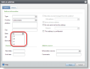
Figure: You can also now view a filtered version of drop-down lists.
Type-ahead functionality allows users to enter values in drop-down fields that do not match entries in the lists, but when users shift focus away from the combo boxes, the program handles any invalid entries appropriately.
For consistency, we recommend that you keep the default settings for the EnableTypeAhead and EnableTypeAheadFilter attributesand retain type-ahead functionality for all drop-down fields that you create. However, if you want to disable type-ahead options for a drop-down field that is populated by a simple Data List or a simple value list, you can set these attributes to false.
To turn off both the ability to type multiple characters in the field and the ability to view a filtered version of the drop-down list, set the EnableTypeAheadattribute to false. For example, on a spec that includes a drop-down field that is populated by a simple Data List, enter EnableTypeAhead="false" in the SimpleDataList element where you designate the simple Data List.
<common:FormField DataType="Integer" FieldID="SimpleDataListFieldRequiredNoTypeAhead" Caption="SimpleDataListFieldRequiredNoTypeAhead" Required="true" >
	<common:SimpleDataList SimpleDataListID="9ce465f7-3d31-4db6-8777-f5376ef59c00" EnableTypeAhead="false" />
</common:FormField>
Setting EnableTypeAhead to false effectively sets both attributes to false because the EnableTypeAheadFilter attribute is only available when EnableTypeAhead is true.
To retain ability to type multiple characters in the field but turn off the ability to view a filtered version of the drop-down list, go to the spec and enter EnableTypeAheadFilter="false" in the same SimpleDataList element:
<common:FormField DataType="Integer" FieldID="SimpleDataListFieldRequiredNoTypeAhead" Caption="SimpleDataListFieldRequiredNoTypeAhead" Required="true" >
	<common:SimpleDataList SimpleDataListID="9ce465f7-3d31-4db6-8777-f5376ef59c00" EnableTypeAhead="true" EnableTypeAheadFilter="false" />
</common:FormField>
You cannot turn off just the EnableTypeAheadFilter attribute for a drop-down field that is populated by a simple value list.
RecordIDParameter Attribute for the Context Element
For the Contextelement, the RecordIDParameterattribute was changed from "required" to "optional" because it is only necessary for specs with stored procedures and not for CLR-based specs. For specs with stored procedures, the RecordIDParameterattribute indicates the name of the parameter within the stored procedure that accepts a record ID. This defines the context value that the Infinity platform passes into the stored procedure, and it is not necessary for specs that do not include stored procedures.
Attribute Values for Fields That Contain Formatted HTML Text
For fields that are designated to contain formatted HTML text, new options were added for how to paste content in the fields, whether to allow class attributes within HTML elements, and which features to include in the editor.
To designate a field to contain formatted HTML text, you insert the Html element as a child element of the FormField element as follows:
<common:FormField FieldID="FIELD3" Caption="Field 3" DataType="String">
	<common:Html></common:Html>
</common:FormField>
Within the Htmlelement, you can specify attributes for the field, and the new release includes one new attribute and new values for two existing attributes.
First, for the PasteTypeattribute that determines how to paste content in the field, you can now select a new "Basic" type to convert text that is pasted into the field into basic HTML. This paste type retains basic styles such as italics, bold, and underlines.
<common:FormField FieldID="FIELD3" Caption="Field 3" DataType="String">
	<common:Html PasteType="Basic"></common:Html>
</common:FormField>
Second, the new AllowClasses attribute allows you to select whether to allow class attributes within HTML elements. By default, this attribute is false, but to allow classes, you just need to set it to true.
<common:FormField FieldID="FIELD3" Caption="Field 3" DataType="String">
	<common:Html AllowClasses="true"></common:Html>
</common:FormField>
And third, for the EditorType attribute that determines the features to include in the HTML editor, you can select the new "SqlServerReport" type limit the HTML editor to only the very basic features that are supported by Microsoft SQL Server Reporting Services 2008.
<common:FormField FieldID="FIELD3" Caption="Field 3" DataType="String">
	<common:Html EditorType="SqlServerReport"></common:Html>
</common:FormField>